by Clinton Boyda
Pull data from 3 API's, merge them then model them to look for any statistical relationships to demonstrate Python Statistical assignment.
- Grab live data from CityBikes API
- specifically generated a list of ebike
stationsin Vancouver, BC, Canada (242 stations found) - assuming free_bikes + ebikes we have 2,288 total bikes in our dataset
- Google Colab Python code in notebook city_bikes.ipyb
 |
|---|
| All ebike Stations in Vancouver as of June 3, 2023 |
- used API's to find Points of Interest (POI's) near each of the
stations- specifically looked within 1000m for "PARKS" with the assumption that park users may use e-bikes
- Google Colab Python code in notebook yelp_foursquare_EDA.ipynb
- merged column from FourSquare of
location_count(for nearby POI's) - merged columns from YELP of
yelp_location_countandyelp_review_countfor total reviews of those POI's- note results from YELP needed to be further filter to remove items like "Trailer Parks"
- merged column from FourSquare of
- merged
review_countsandnumber of "PARKS"nearby for each of our City Bikestations- we can now predict
empty_slots, slots, free_bikesorebikes[selected]
- we can now predict
 |
|---|
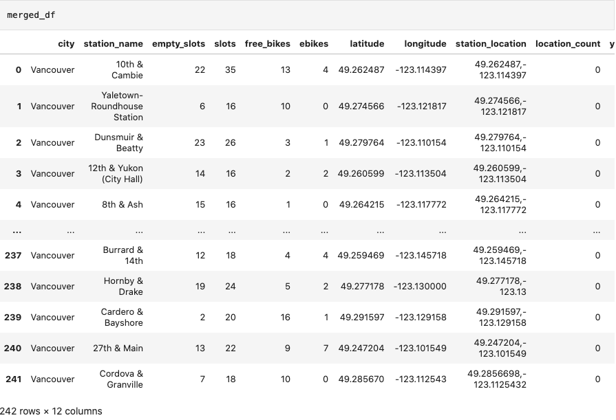
| Final Merged DataFrame |
- Google Colab Python code in notebook joining_data.ipynb
- stored results in CSV format (4x20KB) for quick reference
- exported results in SQLite database format (15MB) created from Python
- counts verified to ensure no dataframe information was missed
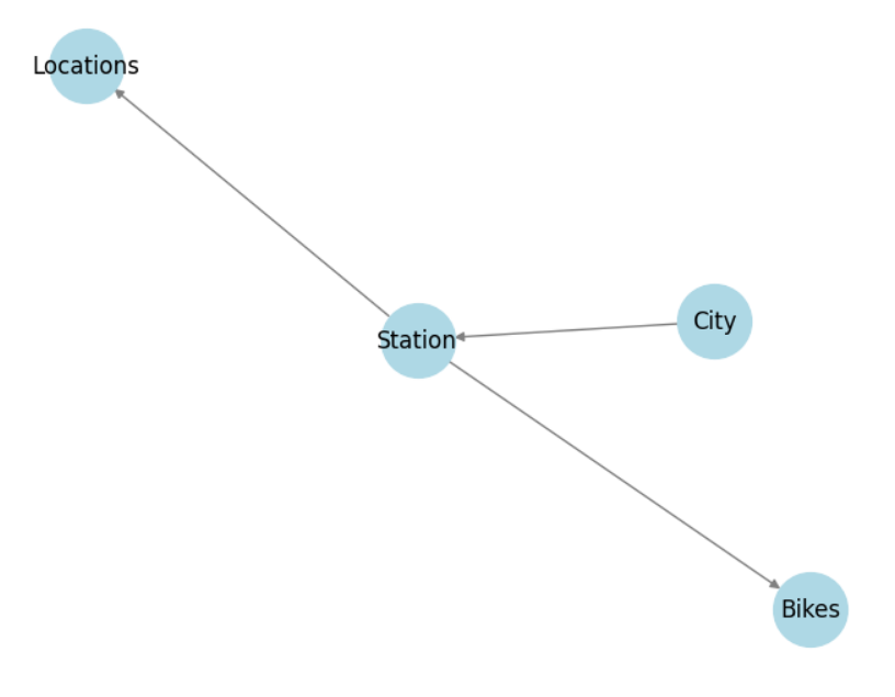
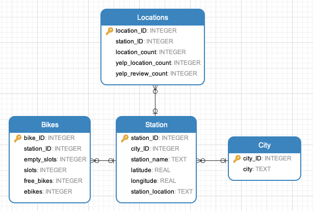
- utilized Python networkx and matplotlib for database relationship illustrations:
 |
|---|
| Database Tables Simplified Relationships |
| :--: |
 |
| :--: |
| SQLite Database Schema |
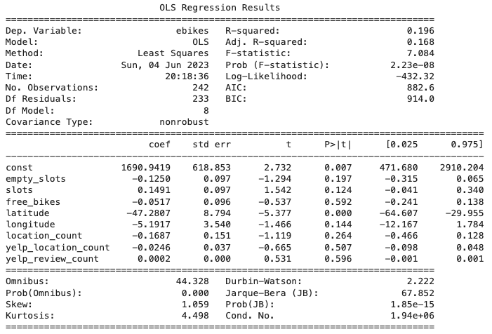
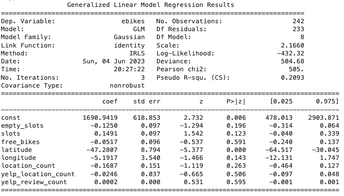
- models created to predict the number of
ebikes - built 3 Statistical Regression Models including:
- Ordinary Least Squares (OLS)
- Linear Regression with 8 models using list method
- Generalized Linear Model (GLM)
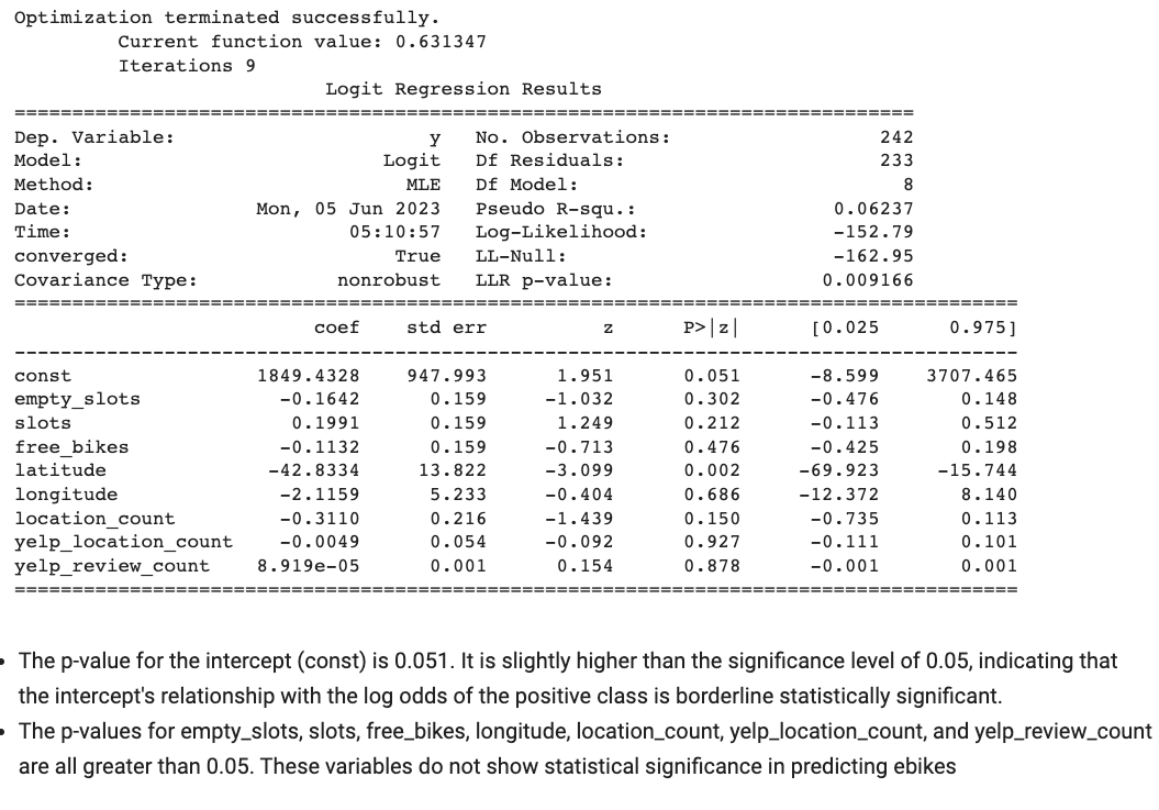
- built Classification Regression Model
- Logistic Regression
STATISTICAL MODEL DETAILS... [click to view]
- Ordinary Least Squares (OLS)
- Linear Regresion (with OLS)
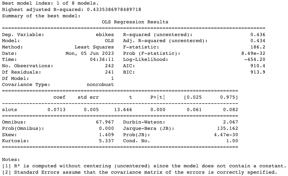
- Generalized Linear Model (GLM)
- Logistical Regression
Fill in what you found about the comparative quality of API coverage in your chosen area and the results of your model.
| Model | Model Fit: R-squared (%) | Model Prediction Accuracy (%) |
|---|---|---|
| OLS Regression | 17.00 | 19.56 |
| Linear Regression | 43.40 | 3.62 |
| GLM Regression | 20.90 | 19.56 |
| Logistic Regression (Classification) | 6.00 | 31.82 |
| Baseline (mean of ebikes) | - | 23.97 |
If a model's fit R-squared value is high but the prediction accuracy is low, it suggests that the model is fitting the training data well but is not generalizing well to new, unseen data.
- Number of Yelp POI results > FourSquare which may be because of the category selected of "PARKS"
- 74.38% of City Bikes stations rows returned NO locations using FourSquare vs Yelp found results for all stations.
- during EDA, various visualization techniques were applied to explore the data and extract meaningful information
- Google Colab Python code in notebook joining_data.ipynb
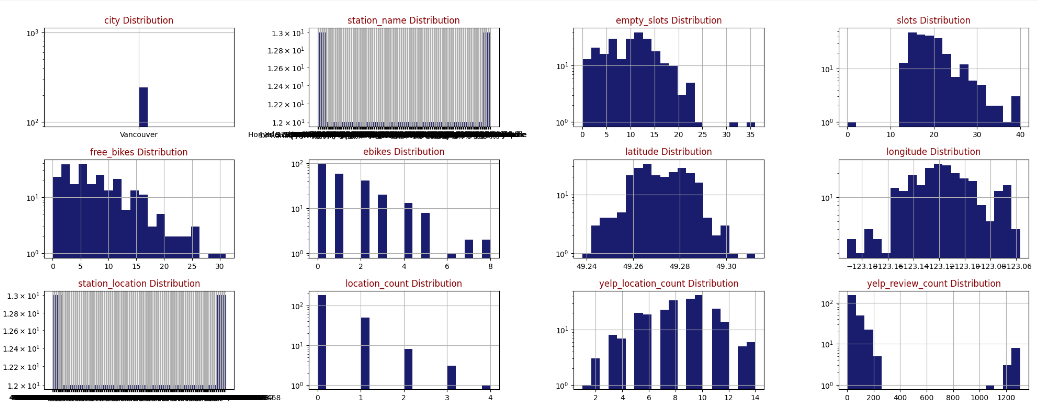 |
|---|
| Feature Histograms by Distribution |
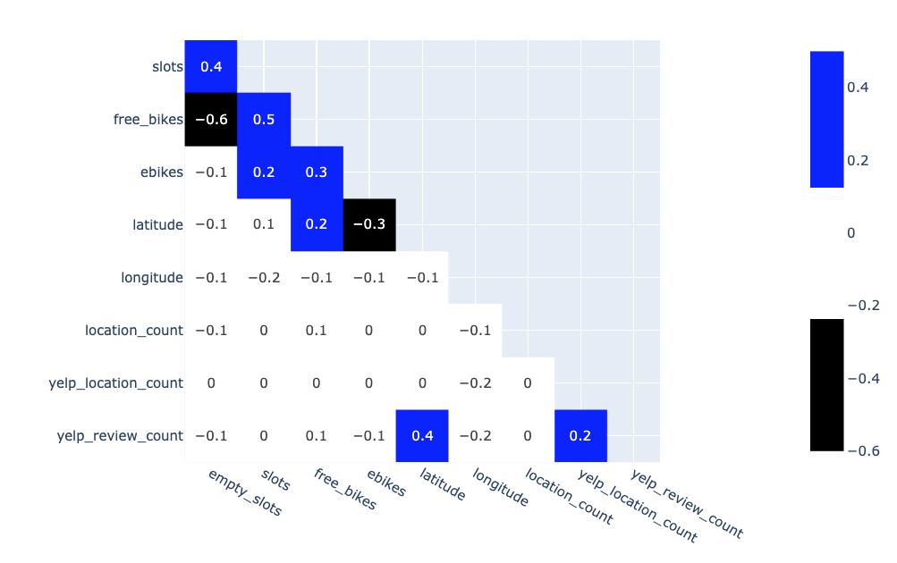 |
|---|
| Correlation Matrix |
- If popularity is defined as # of reviews for the nearby PARKS, the top 10
stationscould be illustrated as:
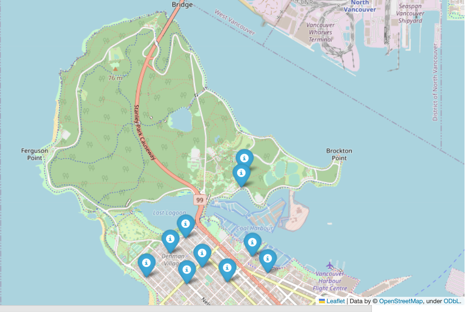 |
|---|
| Top 10 ebike Stations near the highest reviewed PARKS in Vancouver as of June 3, 2023 |
- Google Colab Python code in notebook visualizations.ipynb
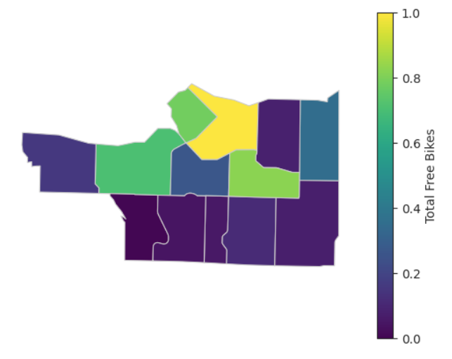
- created visualization to show
free_bikesandebikesby neighbourhood- neighbourhood shape files used from City of Vancouver Open Data Portal allowed the addition of
neighbourhoodcolumn to our dataset
- neighbourhood shape files used from City of Vancouver Open Data Portal allowed the addition of
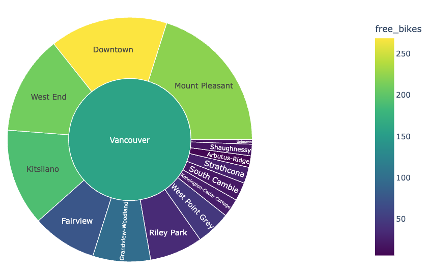 |
|---|
| Interactive Sunburst breakdown of Free Bike Availability by Neighbourhood in Vancouver as of June 3, 2023 |
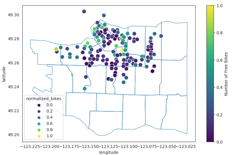 |
|---|
| Free Bike Availability by Station in Vancouver as of June 3, 2023 |
 |
|---|
| Free Bike Availability by Neighbourhood in Vancouver as of June 3, 2023 |
 |
|---|
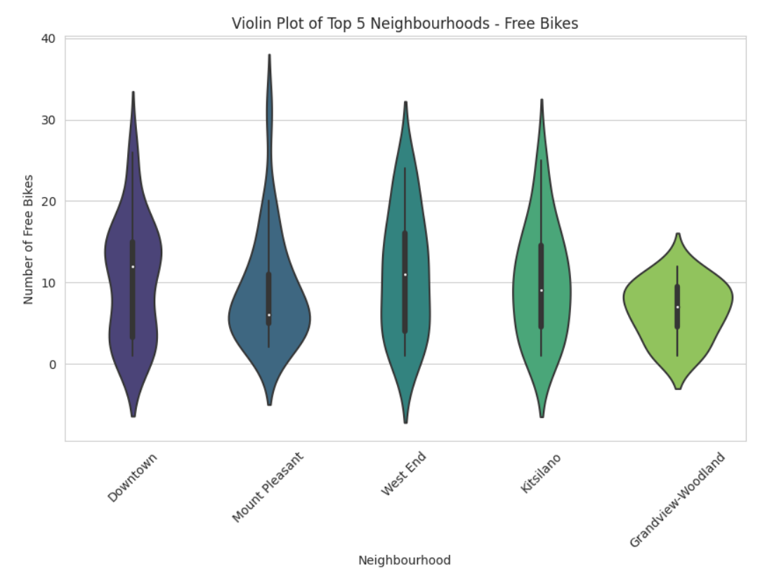
| Free Bike Availability in Top 5 Neighbourhoods in Vancouver as of June 3, 2023 |
What does a violin plot visualization represent?
In a violin plot, the box-and-whisker elements represent the statistical summary of the data distribution for each category or group.
-
Violin shape: The shape of the violin represents the data distribution. It is symmetrical along the central line, which represents the median of the data. The width of the violin at a specific point indicates the density or frequency of data points in that region. A wider section indicates a higher concentration of data points, while a narrower section indicates a lower concentration.
-
White dot: The white dot within the violin represents the median of the data. It is a measure of central tendency and indicates the middle value of the dataset when sorted.
-
Box: The box inside the violin represents the interquartile range (IQR) of the data. It spans from the first quartile (25th percentile) to the third quartile (75th percentile) of the dataset. The height of the box indicates the spread of the middle 50% of the data.
-
Whiskers: The whiskers extend from the box and represent the range of the data excluding outliers. By default, they extend up to 1.5 times the IQR. Data points beyond the whiskers are considered outliers and plotted individually.
-
Outliers: Individual data points that fall beyond the whiskers are plotted as individual points, helping to identify potential anomalies or extreme values in the data.
The violin plot combines aspects of a box plot and a kernel density plot, providing a visual representation of both the distribution and summary statistics of the data. It allows for easy comparison of distributions between different categories or groups in a single plot.
✗ Poor API documentation, would have preferred to find/use these interactive api testing webpages earlier!
- YELP Web API testing page
- FourSquare Web API testing page
- CityBikes API could benefit from clear definitions of each column
✗ Assignment needs more clarification for better statiscally significant results.
- Some questions asked weren't possible based on recommended steps.
- Merging of API data was unclear, decided to aggregate values from points of interest.
What would you do if you had more time?
✓ gather better information to better predict # of ebikes available
✓ consider method to gather data over time to find trends
✓ better document functions and my code for future reference and reusability
✓ rewrite API calls to include actual review scores
✓ rewrite code to allow for easier modification/reusability of universal results including making the call/model formation for
- any city
- other predictions including
free_bikesslots_avialable - any POI category