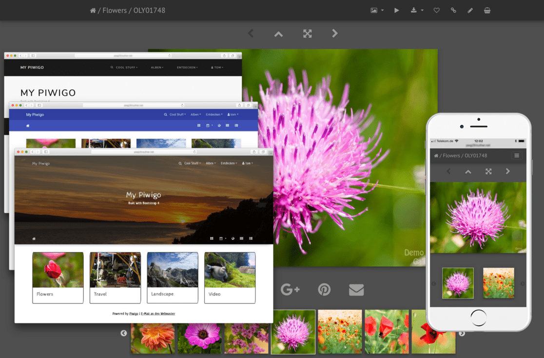
A mobile-ready Phyxo theme based on Piwigo Bootstrap Darkroom
- Various color styles
- Bootswatch
- Material Design
- Darkroom: a dark, low contrast color scheme based on Lightroom® colors (the default)
- Optional page header with fancy fading full width background image, or a jumbotron banner
- Different layout option for the picture details page
- Video support using native HTML 5 video widget
- Fullscreen slideshow view using PhotoSwipe
- Supports auto play
- Supports HTML5 video
- Album thumbnails can be linked to PhotoSwipe directly (like smartpocket)
- Configurable carousel album navigation on the picture page using slick slider
- 100% mobile ready
- fully responsive Navbars, Carousel, PhotoSwipe slideshow, video content
- async/ondemand loading of carousel & PhotoSwipe content, adaptive image size selection, swipe & tap events
- Various configuration options
- Easy customization using CSS overrides or SASS custom build for advanced needs.
- Installation:
- Use the Phyxo built-in plungin manager (preferred)
- or git clone and move to phyxo/themes/simple-responsive
- or download from https://ext.phyxo.net/extension_view.php?eid=5
- Enable Simple Responsive
A demo is available at https://demo.phyxo.net
- Bootstrap 4
- Bootswatch
- Bootstrap Material Design
- PhotoSwipe
- Slick
- jQuery-Touch-Events
- Photography Icons by Dmitry Baranovskiy, licensed under Creative Commons 3.0
- All stylesheets are compiled from Bootstrap's Sass source files using node-sass.
- Dependencies are managed using npm.
- To install build dependencies, use
npm install
The build process is based on npm scripts and uses common shell functions, so it might not work on Windows.
To build everything, use
npm run build
To build only bootswatch, for example, use
npm run build:bootswatch
See package.json for available script commands.
There is built-in support for a custom Sass build.
- Create the file scss/custom/custom.scss
- Include all required Boostrap stuff in there, override variables as you wish, just like any custom bootstrap build
- Compile with
npm run build:custom - Select "Custom" style in the theme's configuration
