

react-awesome-button is a performant, extendable, highly customisable, production ready React Component that renders an animated set of 3D UI buttons. Bundled together with a social share and progress enabled components.
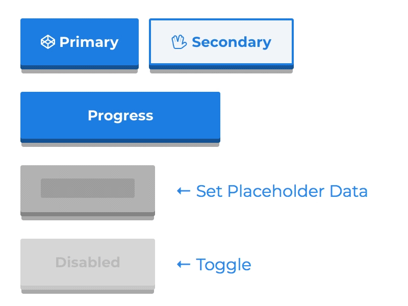
- 60fps 3D animated button
- Animated progress button
- Social icons and network specific share methods
- OnPress ripple effect
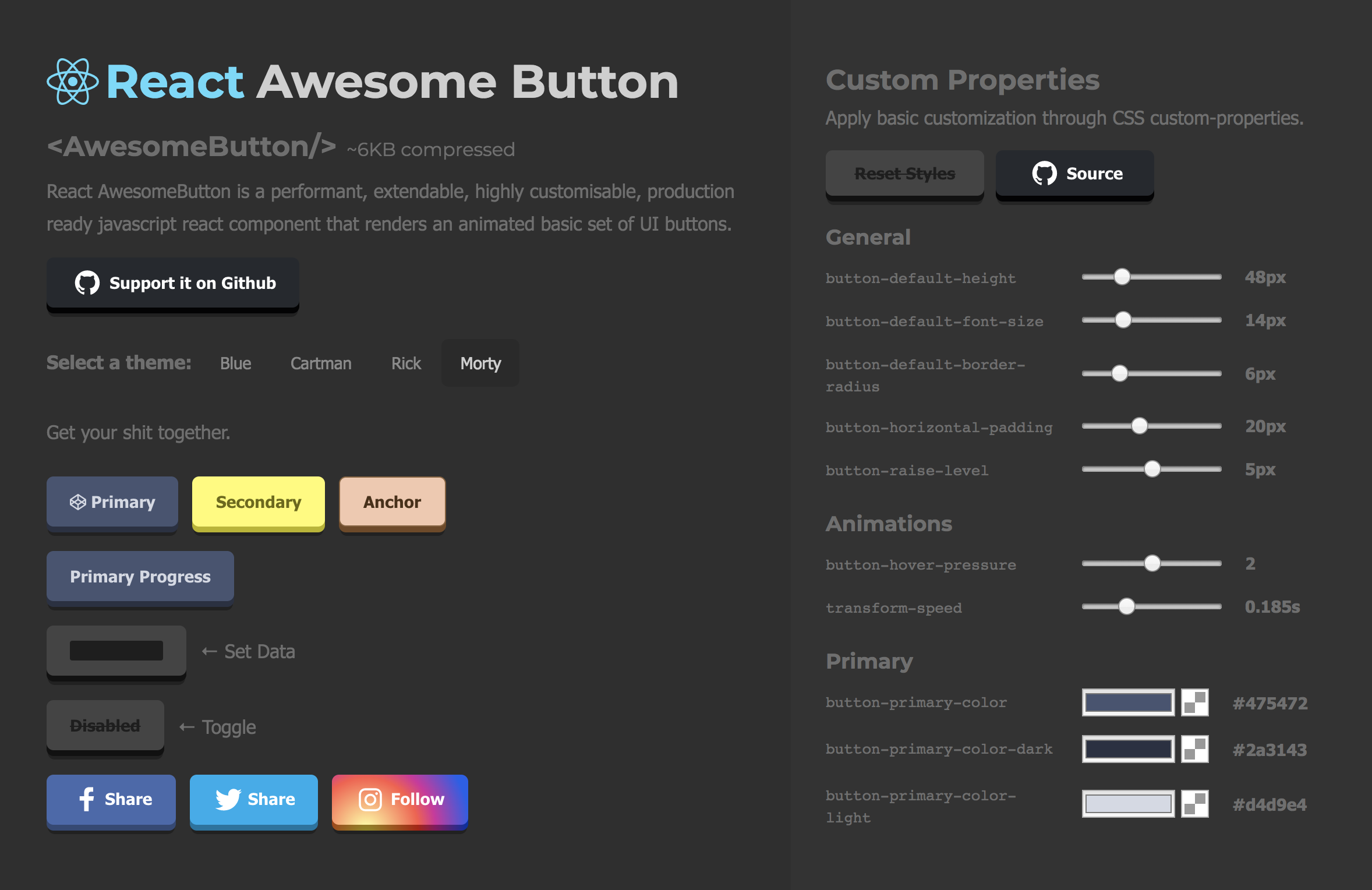
- Look and feel customisable and extendable in two ways: via CSS custom properties or SASS variables and lists (scss config file).
- Use it with CSSModules or **Plain CSS
Checkout the live demo with the CSS customizer at awesome-button.caferati.me.
You can run this demo locally on 8080 by cloning this repository and running npm start
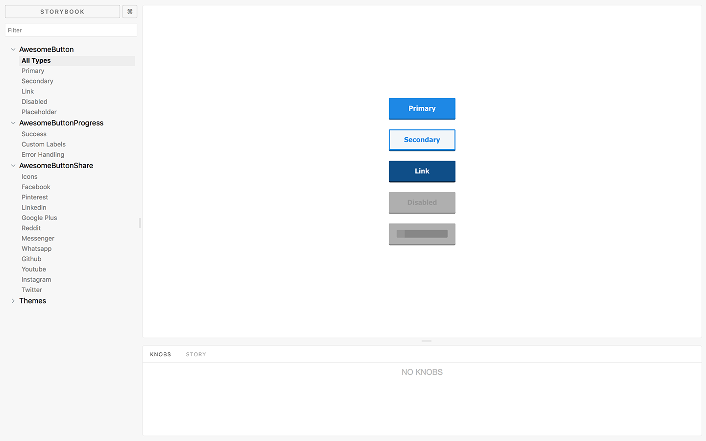
Checkout the Storybook at my web portfolio page.
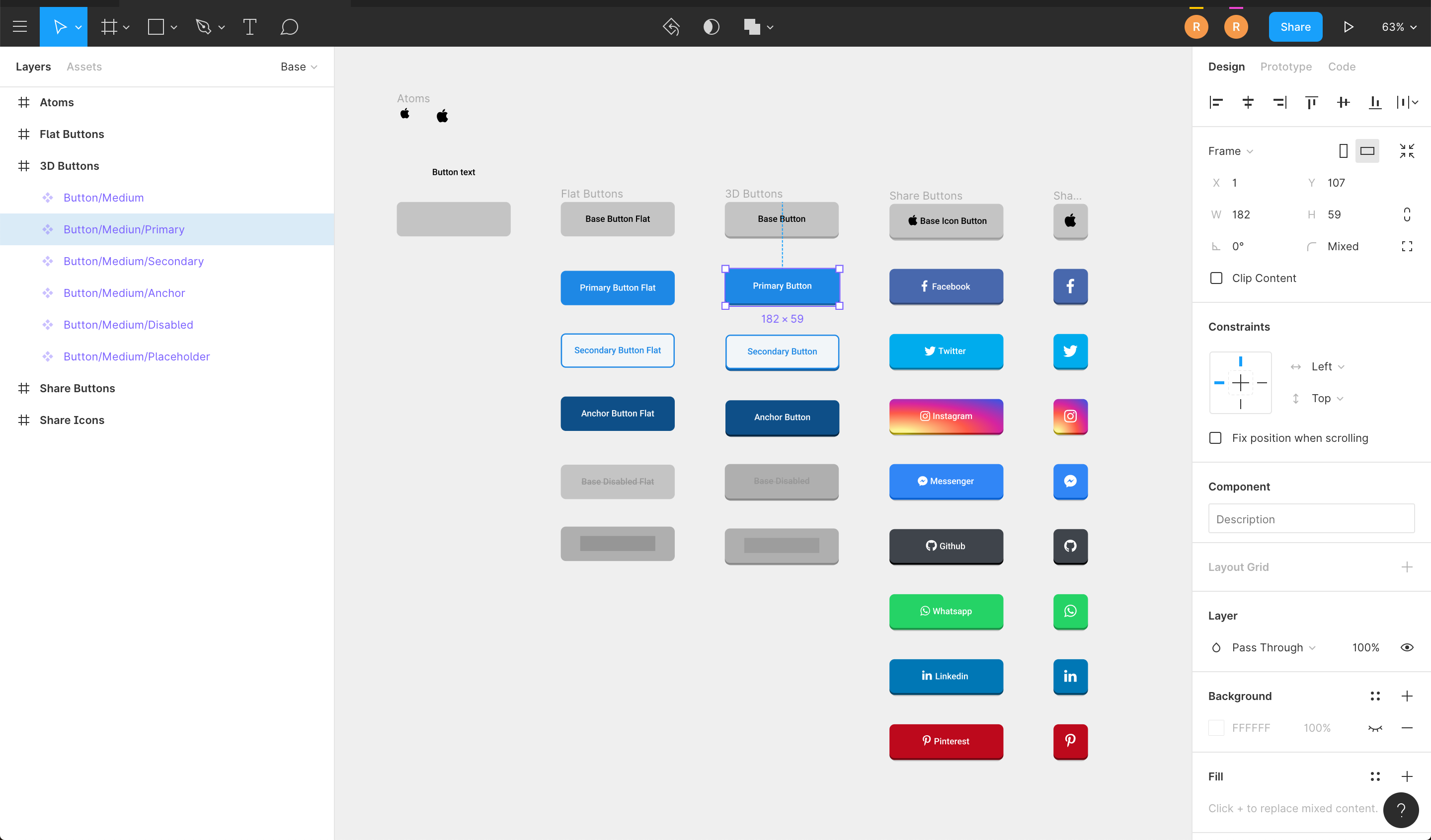
Import it directly into your Figma project.
You can run the storybook locally on 6006 by cloning this repository and running npm run storybook
npm install --save react-awesome-button
import { AwesomeButton } from 'react-awesome-button';
import 'react-awesome-button/dist/styles.css';

function Button() {
  return <AwesomeButton type="primary">Button</AwesomeButton>;
}import { AwesomeButton } from 'react-awesome-button';
import AwesomeButtonStyles from 'react-awesome-button/src/styles/styles.scss';
function Button() {
return (
<AwesomeButton cssModule={AwesomeButtonStyles} type="primary">
Button
</AwesomeButton>
);
}Renders the component with a button HTML tag and an onPress prop called on animation release.
import { AwesomeButton } from 'react-awesome-button';
import AwesomeButtonStyles from 'react-awesome-button/src/styles/styles.scss';

function Button() {
  return (
    <AwesomeButton
      cssModule={AwesomeButtonStyles}
      type="primary"
      onPress={() => {
        // do something
      }}>
      Button
    </AwesomeButton>
  );
}Render the component with an anchor HTML tag setting the href attribute.
import { AwesomeButton } from 'react-awesome-button';
import AwesomeButtonStyles from 'react-awesome-button/src/styles/styles.scss';

function Button() {
  return (
    <AwesomeButton
      cssModule={AwesomeButtonStyles}
      type="primary"
      href="https://google.com">
      Button
    </AwesomeButton>
  );
}| Attribute | Type | Default | Description |
|---|---|---|---|
| type | string |
primary |
Render a specific button type, styled by the .scss type list |
| size | string |
auto |
Render a specific button size, styled by the .scss size list |
| element | node |
null |
Overwrites the default container element renderer, useful for using it with react-router Link component. |
| disabled | bool |
false |
Render the disabled button |
| visible | bool |
true |
Toggle button visibility |
| ripple | bool |
false |
Sets up the button with the onPress ripple effect |
| placeholder | bool |
true |
Should render the animated placeholder on empty children |
| onPress | function |
null |
Default pressRelease event function |
| onPressed | function |
null |
Event function triggered only on full button press |
| onReleased | function |
null |
Event function triggered on button full animation release |
| onMouseDown | function |
null |
Event function coupled with the element's onMouseDown |
| onMouseUp | function |
null |
Event function coupled with the element's onMouseUp |
| href | string |
null |
Forces the button to be rendered on an anchor container and sets the href to the specified value |
| className | string |
null |
Adds a className to the button container element |
| style | object |
null |
Passes a style object to the container element |
| containerProps | object |
null |
Exposes an option for freely adding props to the button container element |
| cssModule | object |
null |
Accepts a css module configuration from the themed module.scss files |
| target | string |
null |
When used together with href renders an anchor with a specific target attribute |
| before | React.Node |
null |
Render a node before the main content span container; useful for setting icons |
| after | React.Node |
null |
Render a node after the main content span container; useful for setting icons |
| between | string |
null |
Sets the content elements relation to space-between; useful for setting icons |
| active | bool |
false |
When set to true activates the pressIn animation |
Checkout this example live on the storyboard.
import { AwesomeButtonProgress } from 'react-awesome-button';
import AwesomeButtonStyles from 'react-awesome-button/src/styles/styles.scss';

function Button() {
  return (
    <AwesomeButtonProgress
      cssModule={AwesomeButtonStyles}
      type="primary"
      onPress={(event, release) => {
        // do a sync/async task then call `release()`
      }}>
      Button
    </AwesomeButtonProgress>
  );
}Being a wrapper on the AwesomeButton component, it accepts its props plus the following ones.
| Attribute | Type | Default | Description |
|---|---|---|---|
| onPress | function |
null |
Default onPress function returning the event and a button release strategy |
| loadingLabel | string |
Wait .. |
Progress button loading label text |
| resultLabel | string |
Success! |
Progress button success label text |
| releaseDelay | number |
500 | Delay for releasing the button after the progress animation |
If nothing is passed on the sharer prop, the component automatically gets the page's own title and og:image properties; otherwise, it's setup by the sharer.
  import { AwesomeButtonSocial } from 'react-awesome-button';
  import AwesomeButtonStyles from 'react-awesome-button/src/styles/styles.scss'

  function Button() {
    return (
      <AwesomeButtonSocial
        cssModule={AwesomeButtonStyles}
        type="facebook"
        sharer={{
          url="https://caferati.me"
        }}
      >
        Button
      </AwesomeButton>
    );
} import { AwesomeButtonSocial } from 'react-awesome-button';
import AwesomeButtonStyles from 'react-awesome-button/src/styles/styles.scss'
function Button() {
return (
<AwesomeButtonSocial
cssModule={AwesomeButtonStyles}
type="whatsapp"
sharer={{
phone: '############',
message: 'Whatsapp init message'
}}
>
Button
</AwesomeButton>
);
}Being a wrapper on the AwesomeButton component, it accepts its props plus the following ones.
| Attribute | Type | Default | Description |
|---|---|---|---|
| type | string |
null |
Render a button type (Facebook, Instagram, Twitter, Github, Youtube, Linkedin, Pinterest, Reddit, Messenger, Whatsapp) |
| icon | bool or Dimensions |
true |
Setting to false avoids icon rendering; if the dimensions type is passed in {width: number, height: number}, configures the button size |
| sharer.url | string |
null |
Url string to be used on the sharer |
| sharer.image | string |
null |
Image url to be rendered on the sharer |
| sharer.message | string |
null |
Message string to be rendered on the shared post |
| sharer.phone | string |
null |
Phone number to be used when using the Whatsapp sharer type |
| sharer.user | string |
null |
Username to be redirected when using the Messenger sharer type |
Checkout the React Native version of the Awesome Button UI Component at rcaferati/react-native-really-awesome-button

- Checkout my Full-Stack Web Developer Website
- Other open source projects @ Code Laboratory
- A scope of my work @ Web Developer Portfolio
MIT. Copyright (c) 2019 Rafael Caferati.