Consolidate icon styles into AccessibleImage.css and SourceIcon.css #7890
Conversation
|
Checked the following components for any major regressions, and couldn't find much apart from the minor ones I list below. Really great job on this - thanks @fvsch!!!
I only ran into a few things:
|


|
Thank you for the thorough check @jaril! |
|
|
Great work @fvsch ! Great progress. I spotted a few things:
|


|
Hmm, looks like the |
|
@darkwing I rolled back the change to SourceIcon classes and selectors, which fixes the issues you reported. We should be good to go. |
|
Very nice @fvsch ! I found just one last issue: the close icons ("x") look too big, unless UX decided to increase them:
|

|
@darkwing In Firefox 66 we updated the Plus and Close icons in mozilla-central (so for all the other DevTools panels) to use the Photon icons, which look bigger with their 2px strokes. That being said, your screenshots look strange to me because the Plus icon should be fatter, and the Close icon should be a tad slimmer. Could it be a browser cache issue? I'll check on my side too. |
|
@darkwing It looks like you have the new CSS styles with the old icons displayed.
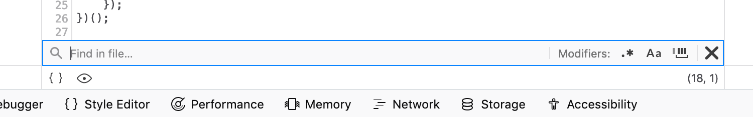
We do need a bit of padding at the right of the "find in files" search input, though. |
Fixed in latest update. |
|
Amazing work @fvsch ! |
Fixes #7735
This is an alternative to PR #7841 by @jaril, following the methodology described in:
#7841 (comment)
Summary of Changes
.imgto be 16 by 16px, use--theme-icon-colorand mask styles.img.searchinstead.I know there is a LOT in that pull request, but I don't think there would be much value in trying to break it up in half a dozen PRs. The changes are all somewhat related to deduplicating image styles and making sure images are 16x16 99% of the time and look good with the accompanying content. JS changes are limited to changing classes, icon names, and exceptionally moving an element outside of its parent and into its grandparent container.
I'm prepared to work on follow-up CSS fixes if I've regressed a few specific styles.
The best way to test this PR would be to check it out and take it for a ride, paying extra attention to icons in Sources and in search UIs.